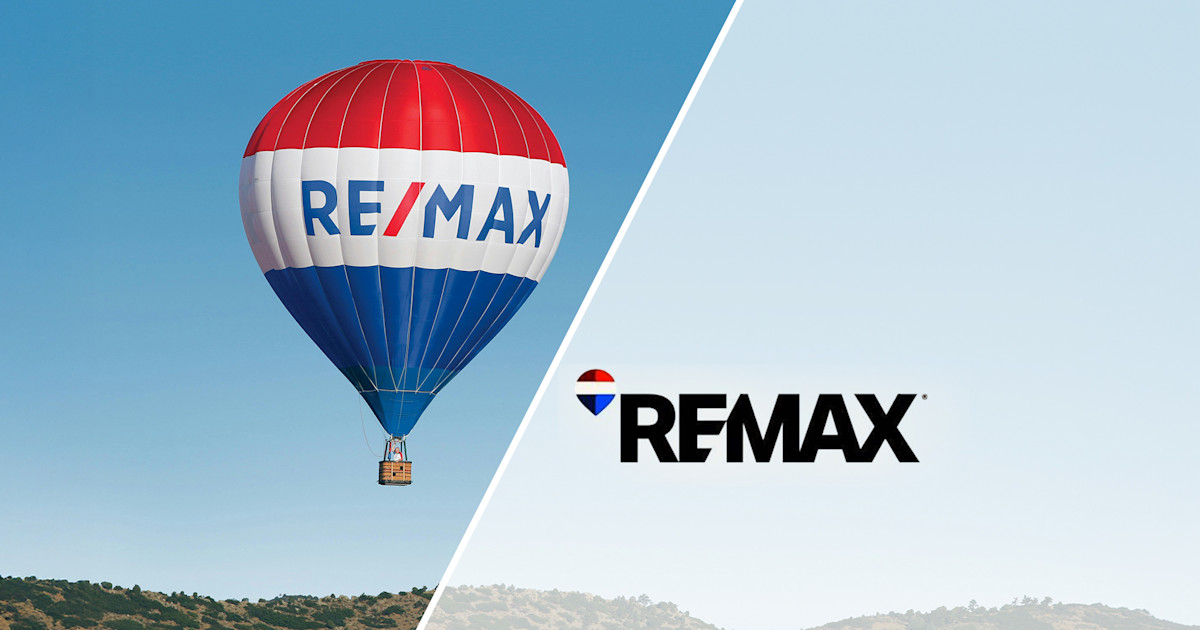
R
E/MAX has unveiled a new, "digital-first" logo that modernizes the iconic red, white and blue balloon design. The change aims to enhance the brand's online presence, particularly in social media channels and digital advertising. According to RE/MAX executive vice president of marketing Abby Lee, the goal is for agents to "show up better" in these spaces.
The new logo was developed with Camp + King and has been met with mixed reactions from agents and industry observers. A survey conducted by RE/MAX found that 78% of respondents still recognized the new balloon design as the company's logo, even without the wordmark. The data also showed that potential buyers and sellers preferred the new logo over the old design and those of key competitors.
While some agents have expressed enthusiasm for the fresh look, others are concerned about the cost or feel that RE/MAX is losing its identity. The design community on Reddit has noted similarities to the Pepsi logo. Despite the controversy, the rebranding effort has generated significant buzz around the company.